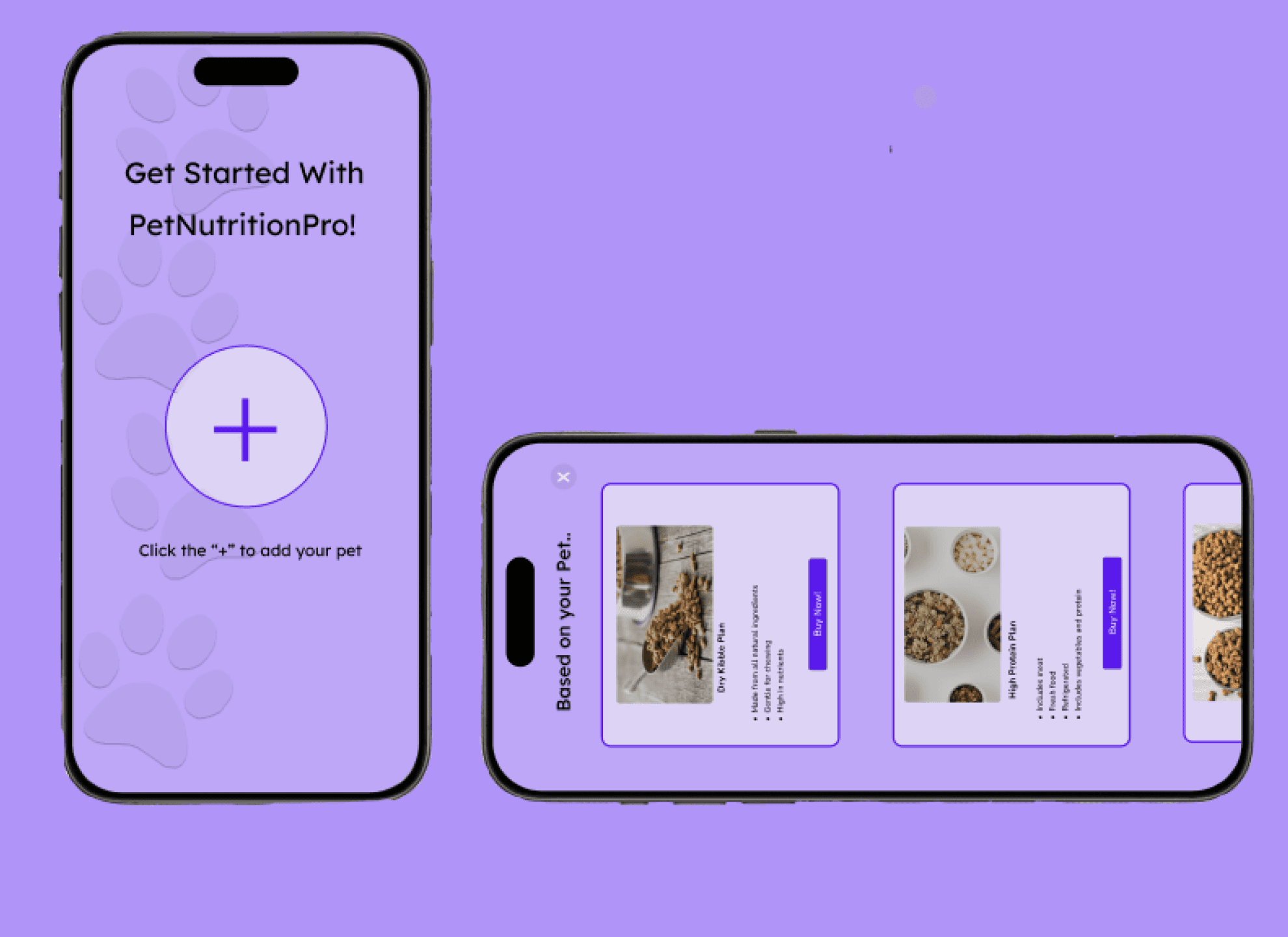
Background:
In recent years, there has been a surge in pet owners recognizing the role of nutrition in pet health. Research, including studies from the Journal of Animal Physiology and Animal Nutrition, emphasizes the link between nutrition and pet well-being, ranging from weight management to disease prevention.This growing awareness has prompted a shift towards subscription-based models for pet food, as revealed by insights from the American Pet Products Association (APPA).
My Design Process:
Problem Space:
There is a lack of accessible tools that empower pet owners to make informed dietary decisions for their pets. Existing pet food subscription services often provide a standard diet plan without considering the individual nutritional needs of each pet. Additionally, pet owners are often left in the dark about the specific ingredients and nutrient levels of the pet food they are using, making it challenging for pet owners to assess the quality of pet food. The problem space revolves around the need for a comprehensive and personalized nutrition tracking app within the subscription-based pet food landscape.

Design Question:
How do we create a product that addresses the lack of individualized nutrition plans, provides transparency in pet food content, and offers tools for monitoring and addressing potential health issues related to pet nutrition?
Proposed Solution:
PetNutritionPro is a mobile application that is designed to revolutionize the way pet-owners approach their pets’ nutrition within the subscription-based pet food landscape. This app addresses the problems in the problem space by providing transparency and personalized care to enhance the well-being of pets.
PetNutritionPro: A pet nutrition tracking, reminder, and health application.
Usability Testing



Research
Ideation
Prototype
Evaluation
Research
Duration:
5 weeks
My Role:
Product Designer
I began my project by conducting user interviews and internet research to understand the issues that currently impact pet owners. I interviewed four adults with pets and the questions revolved around motivations, pain points, and processes regarding pet nutrition tracking, buying the right food, and other potential features for the application.
“I sometimes forget to buy my dog his next batch of food” - Interviewee 1
“Minerals, such as calcium, help to keep their bones strong, while iron is important for healthy blood”
Key Takeaways
It is difficult to find out what ingredients are in pet food that comes from vendors
Useful to have an easy way to remember to feed your pet and order new food
If a pet has a disease that is linked with nutrition, owners want a way to access personalized meal plans that can aid them in their disease journey
These interviews helped me establish user goals
"It would be helpful if the meal sizes came pre-portioned” - Interviewee 2
Personas
After conducting interviews, I made two user personas. Grace and Elsie have different user needs that the application would have to simultaneously accommodate. Through creating the app, I acknowledged these personas to make sure my design goals aligned with their needs and to make sure I was acknowledging pain points. Having this framework helped me think of design ideas.
Gracie Smith
Age: 55
Work: Engineer
Family: Married, two kids
Location: San Ramon, CA
Goals:
Gracie wants an organized platform for tracking her dog's meals. She also wants to know if her dog is receiving the proper food for his specific breed.
Frustrations:
Currently, Gracie manually portions out her dog’s food based on what the veterinarian recommends. However, she always forgets to order the next batch of food before it all runs out.
Personality:
Humble
Organized
Curious
Motivated
Bio:
Meet Timothy, a 55-year-old dog enthusiast with a 9-year-old Yorkshire Terrier. Luckily, his pet does not have any health concerns. To ensure his canine companion's well-being, Timothy is on the lookout for a streamlined platform that not only helps him track his dog's food intake but also sends timely alerts to remind him when it's time to order more pet food.
Preferred Applications:
Elsie Rose
Age: 27
Work: Teacher
Family: N/A
Location: San Ramon, CA
Goals:
Elsie lives with her parents who both have busy schedules and often forget to order food for her cat. Her cat has arthritis and Elsie knows there are certain foods that are higher in vitamins and could help her cat strengthen her bones. She wants order food from a vendor that has the right food for her pet.
Frustrations:
Elsie gets stressed out knowing if she’s feeding her cat correctly. She is currently on medication and Elsie wants to know if the food she gives her is safe with her condition.
Personality:
Strong
Dedicated
Organized
Hard-working
Bio:
This is Elsie, a 27 year-old teacher with a 5 year-old siamese cat that has arthritis. Her cat is on medication however she wants to find a good eating routine for her. She feels as though she should feed her food with nutrients but has no way to track the nutrients.
Preferred Applications:
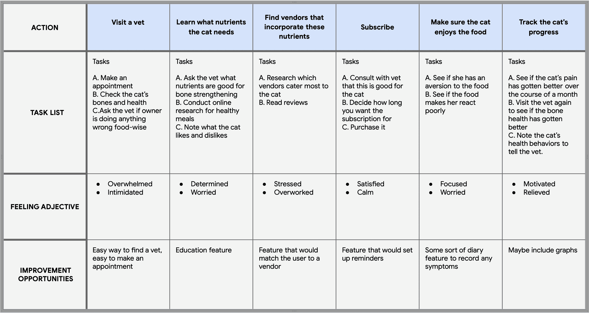
User Journey Map
In my next stage of research, I created a user journey map to empathize with the user’s needs. This map helped me anticipate obstacles and get rid of any designer bias.
In this specific user journey map, I used the scenario of Elsie wanting to find a personalized meal plan for her cat. Elsie’s emotions helped guide me in creating our prototypes.
Goal: Find a weekly meal plan for her cat that is personalized to her cat’s health
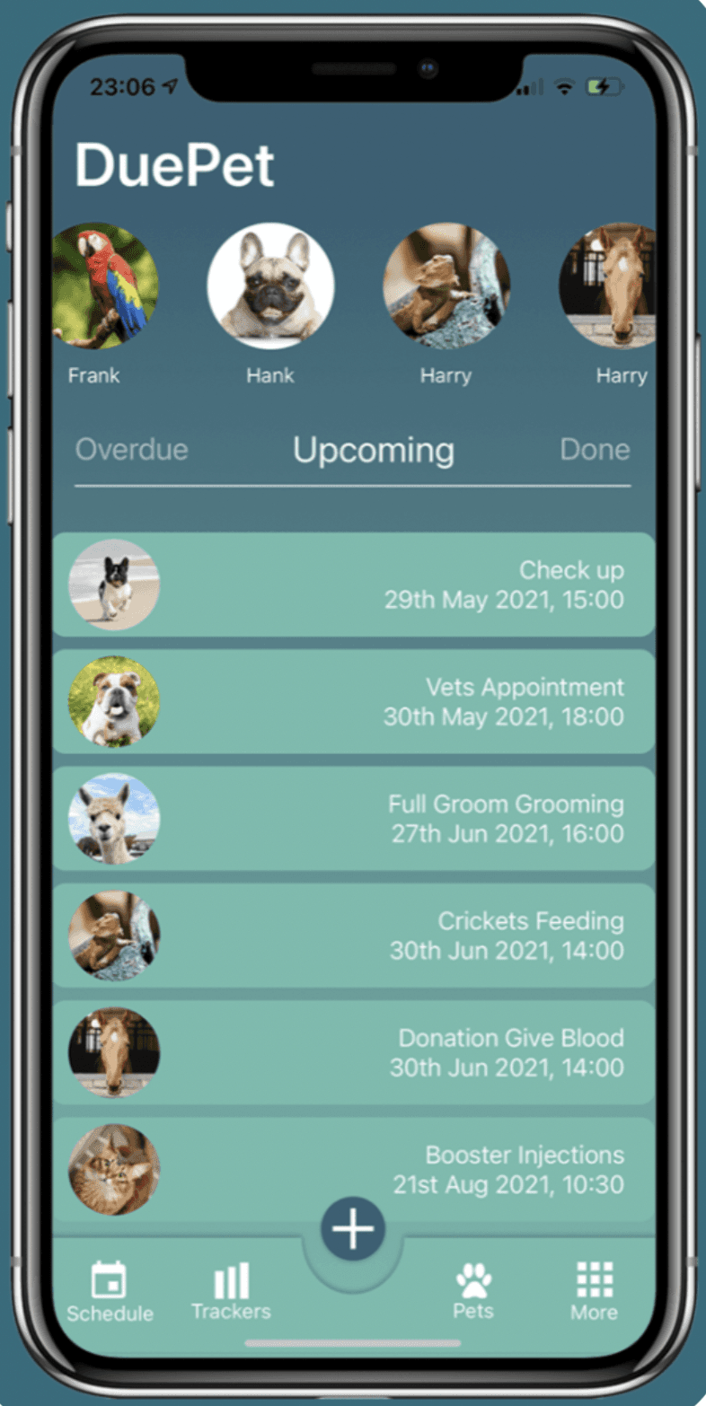
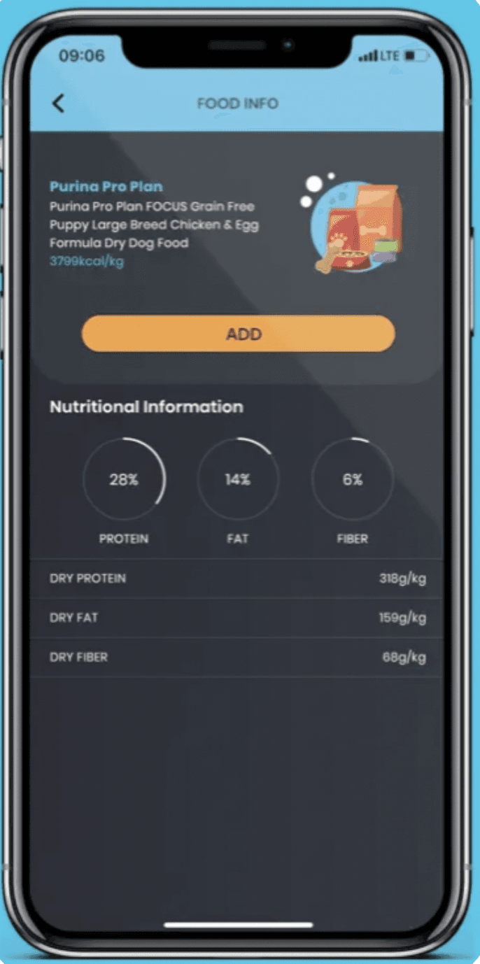
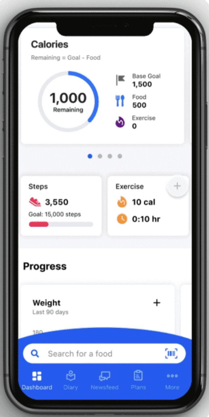
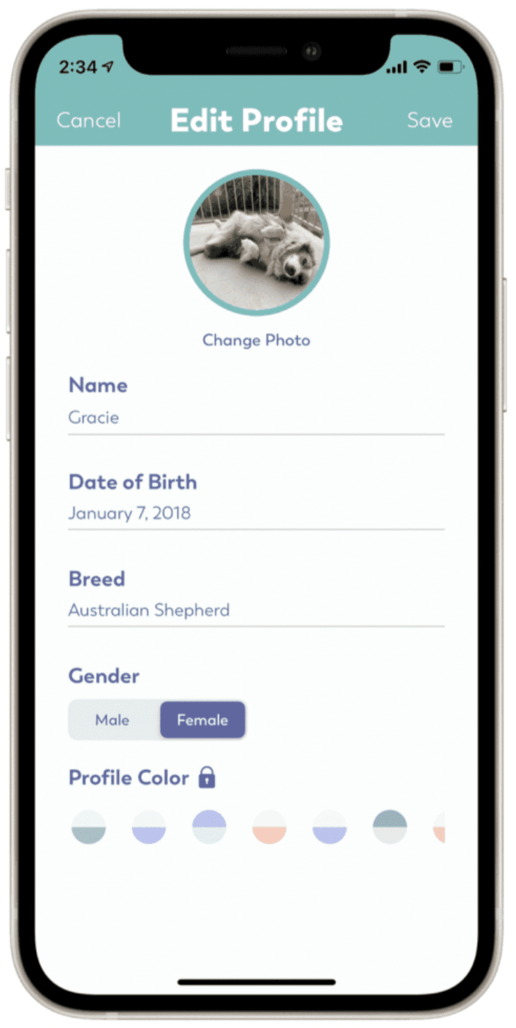
Direct Competitor: DuePet
Direct Competitor: PAWSM
Indirect Competitor: MyFitnessPal
Indirect Competitor: Puppr
Goal Statement
This mobile application will let users subscribe to vendors that create personalized meal plans for their pet, track their pet’s nutrient intake, and receive reminders on when to feed their pet. I will measure effectiveness by sending out two surveys to every new user after the first week and after the first month to receive feedback
Ideation
Competitive Analysis
I conducted 4 competitive analysis on companies with similar features as our design problem. Our analysis focused on reminder setting, food tracking, and profile page. By recognizing where these competitors fell short we were able to better identify inclusive design opportunities.
Key Takeaways
Interaction: Easier to navigate if there is a navigation bar at the bottom of every page, consider using haptics for better accessibility
Visual Design: Crowding the page makes it difficult to stay engaged, big fonts and minimal writing helps locate important material, Iconography and color keeps the page engaging
First Impression: Important to chose colors that contrast with each other
Rapid Sketch
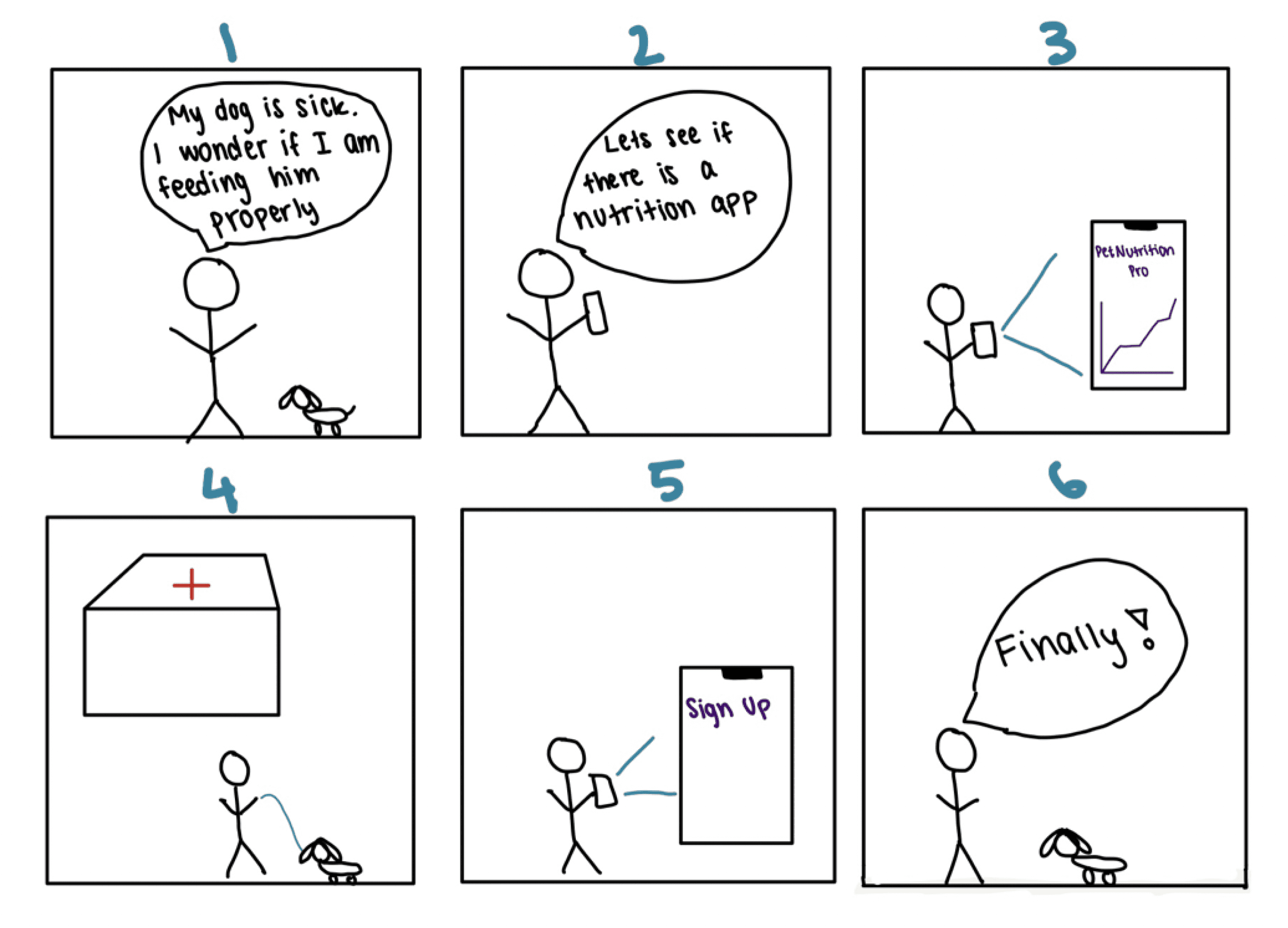
Based on my research insights, I did a quick rapid sketch in order to brainstorm solutions given the problem statement. This gave me a few tentative ideas that I can potentially add to my application when I start designing.
The scenario:
1) Steve is worried because he is not sure if he is feeding his dog properly. He has not had time to do research so he just bought what he saw at the store.
2) After his dog gets sick, he searches for a nutrition tracking application
3) He finds PetNutritionPro
4) Since the app asks for specific questions about his dog, he goes to the vet to retrieve all this information
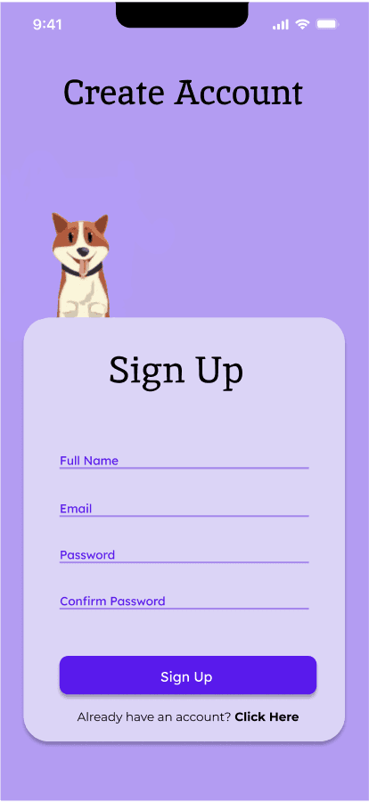
5) He signs up
6) His dog has been finally eating properly.
Quiz about pet’s identity and health
Tracks what pet eats everyday
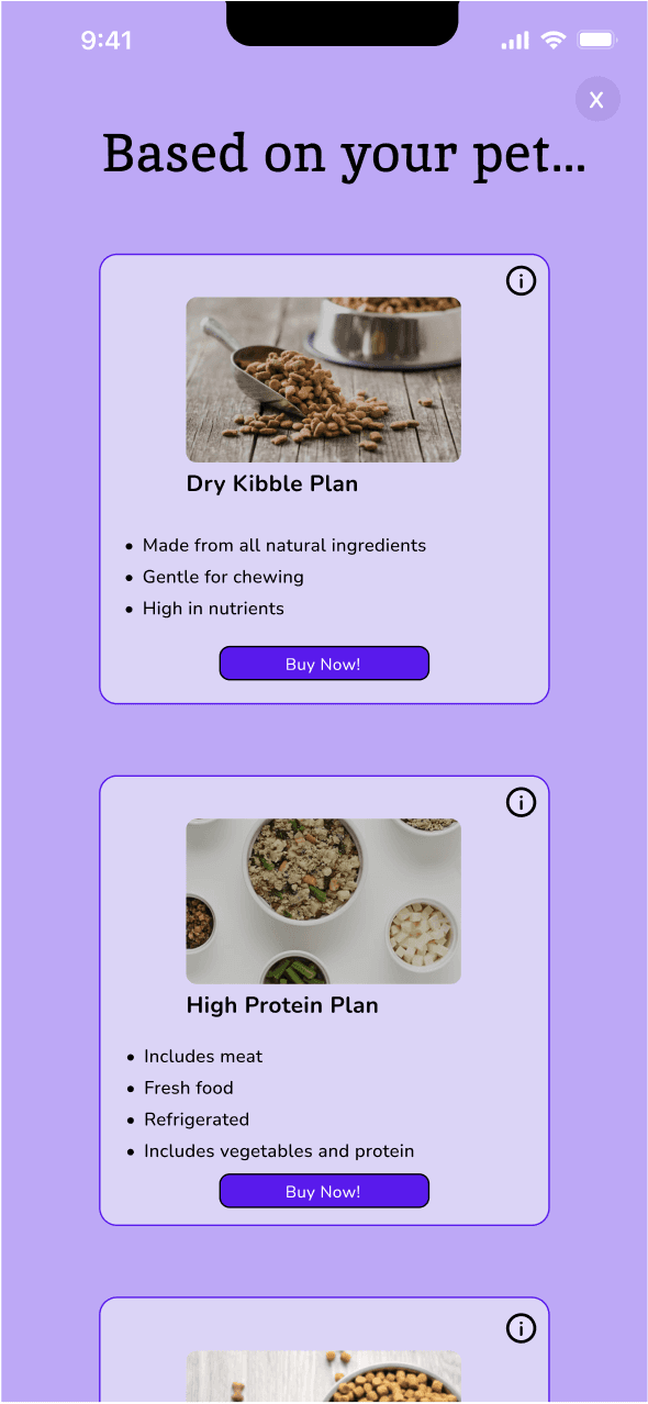
Personalized meal plans
Prototyping
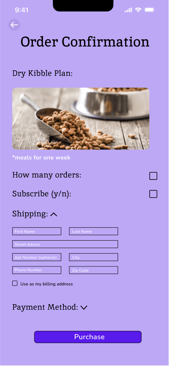
I created a user flow by estimating the typical path taken by a user when using this app. I began by outlining task steps starting from opening the application to successfully purchasing a meal plan. This helped me visualize my application and decide which each wireframe would represent.
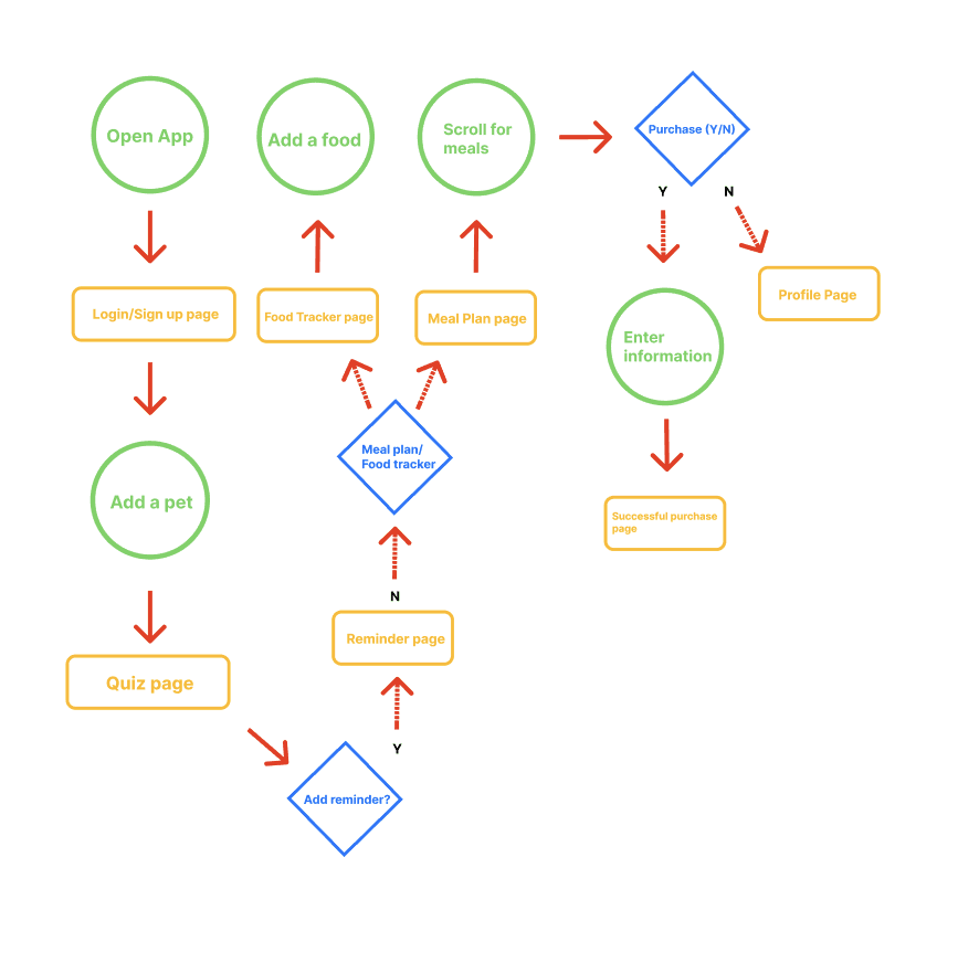
Key:
circles: action
rectangles: screen
diamonds: decision
Key:
circles: action
rectangles: screen
diamonds: decision
Low-Fidelity Prototypes
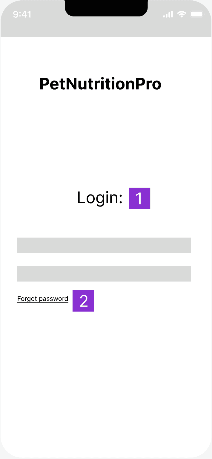
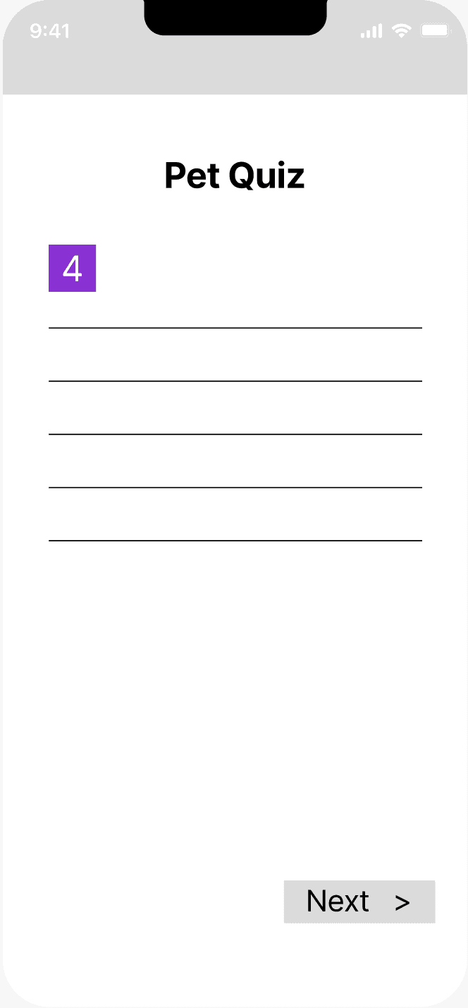
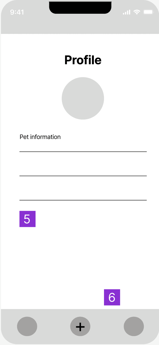
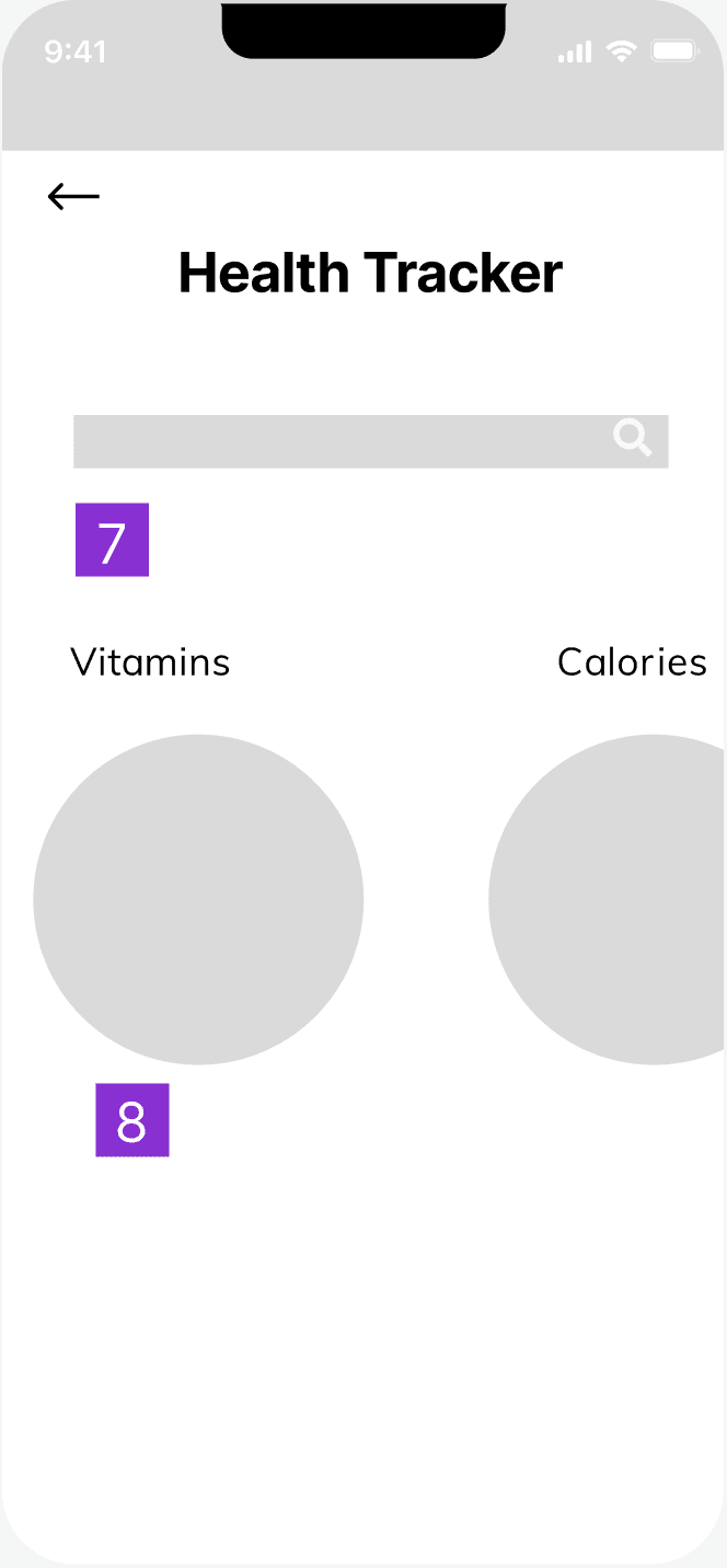
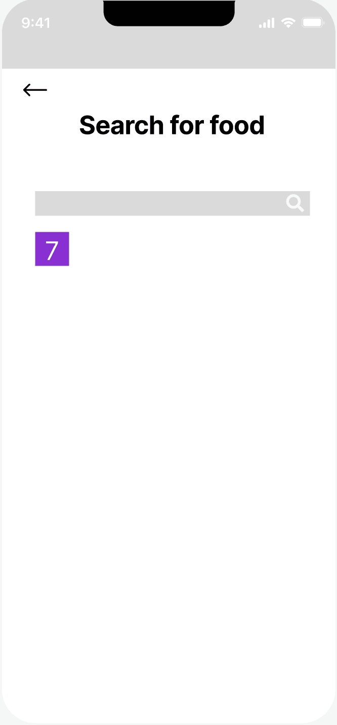
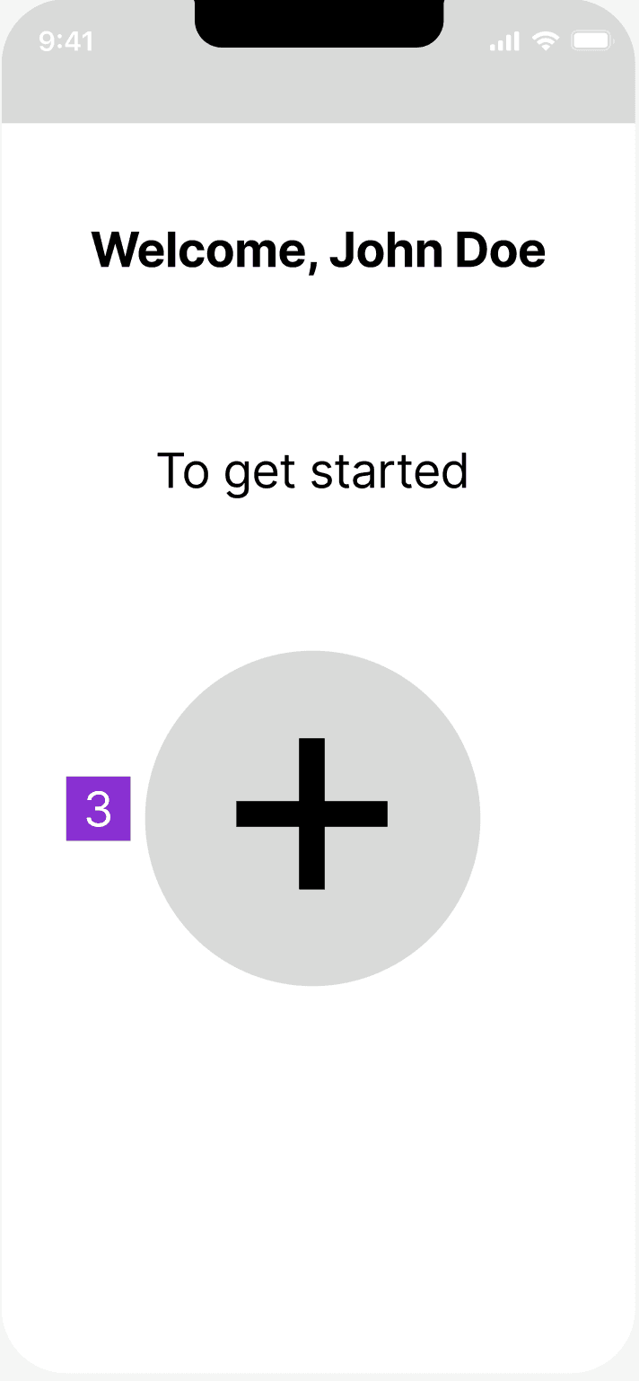
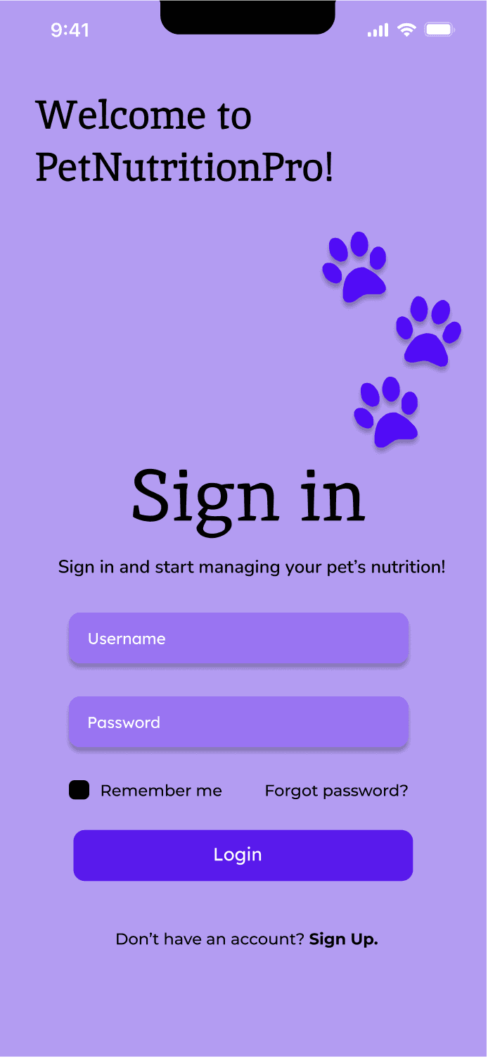
1) Gives users the option to login using their username and password
2) Gives users the option to reset their password if forgotten
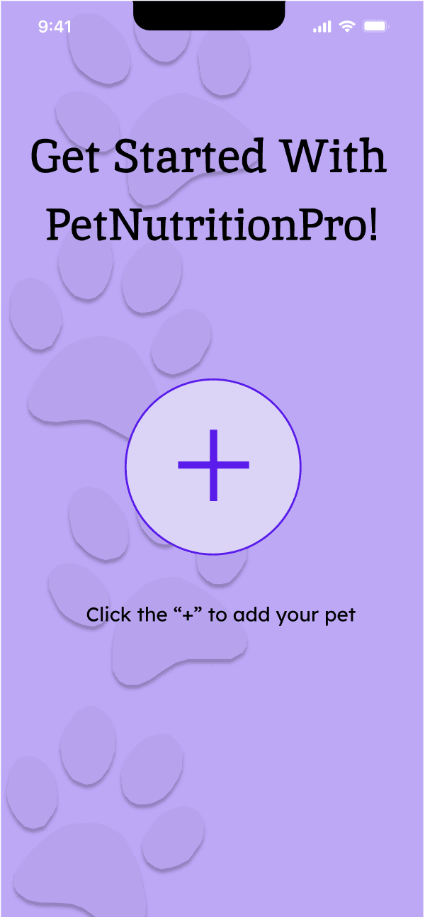
3) Click the “+” to add a pet
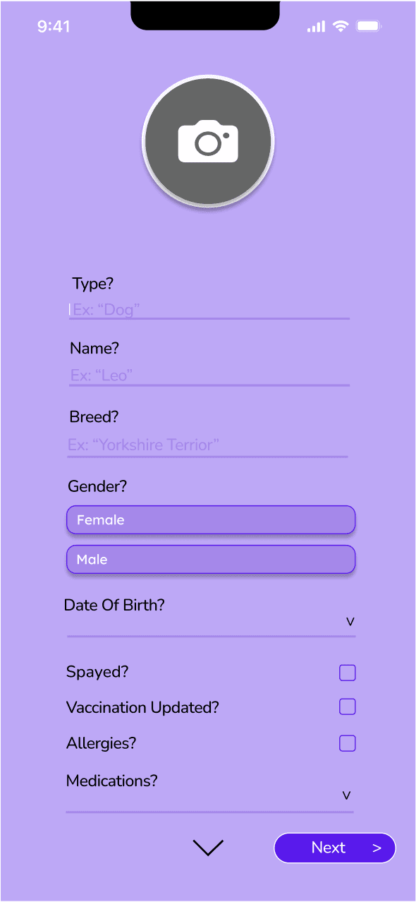
4) Fill out the questionnaire specific to user’s pet. Avoid free-response questions.
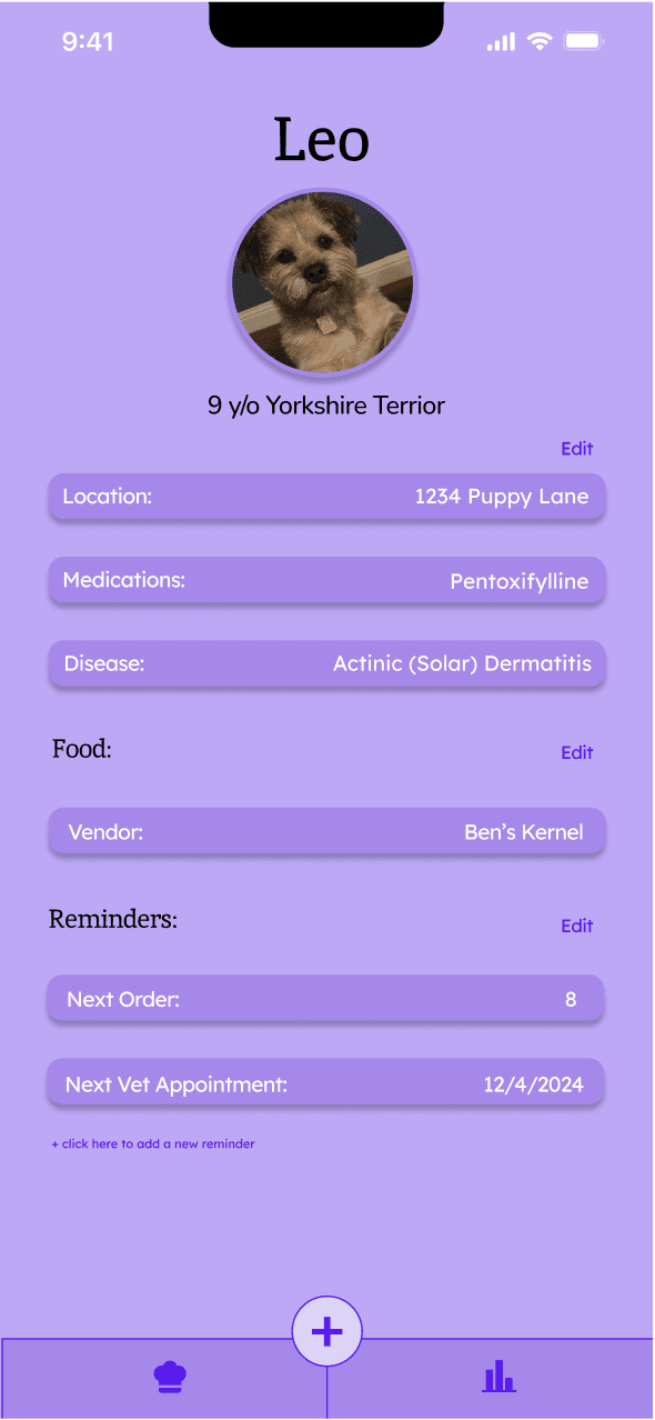
5) Summarizes pet information and serves as home page
6) Navigation bar
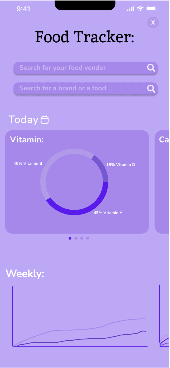
7) Search bar for any food that your pet ate, includes vendors
8) Calculates the macros of what your pet ate in a day
Annotated Wireframes
Evaluation
Easy to navigate through
Personalized meal plans made the app stronger compared to it’s competitors
Key Takeaways:
To test the efficiency of the low-fidelity prototypes and get valuable insight, I recruited three relevant participants to interact with the prototype.
(3 of 3) Were able to “add a pet” and navigate through the application within one minute.
(2 of 3) Found the meal plan feature to be a useful feature that seems impactful for pets.
(2 of 3) Would find the health tracker feature more useful if there was something that recorded the data.
(1 of 3) Found it would be useful to have some sort of reminder feature
High-fidelity prototypes
Using Gestalt’s principle of Proximity, I created some interactive Figma prototypes. Here are some revisions I kept in mind while creating these wireframes:
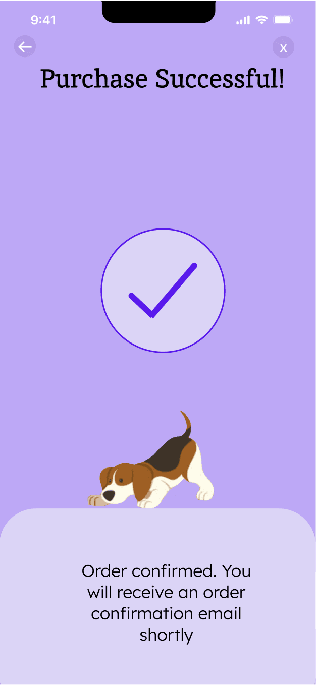
Incorporated haptic technology for the “Purchase successful” frame that sends vibrations to confirm the purchase.
Made background solid color to avoid distractions while using the app.
Added an area to create and see reminders.
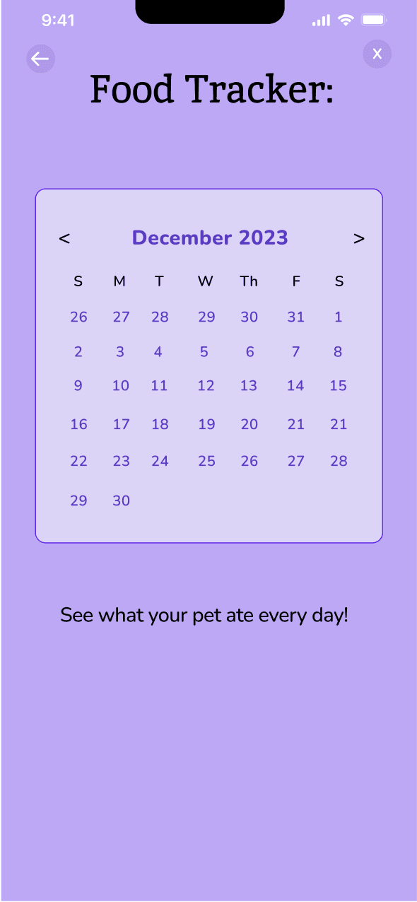
Added a calendar feature that functions as a diary and records what the pet ate every day.
Added an “ingredients” page to educate users on what exactly the meals are made of.
Reflection
Throughout this project, I learned more about the importance of conducting user research in order to create impactful user experiences. After conducting user interviews and making design decisions based on research insights, I feel more prepared for the UX industry.
Something I struggled with was working on this project without a team. When I collaborate with others, I gain insight from diverse perspectives which reflects in the product. I believe that if there is more diversity in creating a product, the product will cater to more diverse users as well.
If I had more time to work on this project, I would have focused on making the design more inclusive and
user-friendly by conducting thorough usability testing with a diverse group of individuals. This would have allowed me to gather valuable feedback on accessibility, user preferences, and potential challenges faced by users with different backgrounds and abilities, ensuring that the final product is not only functional but genuinely caters to a broader and more diverse user base.
Copyright @ Sanika Gadam
gadamsan@uw.edu
